- The heart of the site was the individual movie review page. We tryied to achieve a very stylish magazine look, including planned image grids, pull-quotes from the article, and movie cast and crew details in the side-margins.
- The home page was kept bright and simple, just the logo, along with thumbnail-supported lists of the latest reviews and feature articles added to the site. The focus was put on the material and not on sticking to the structure of a typical web site.
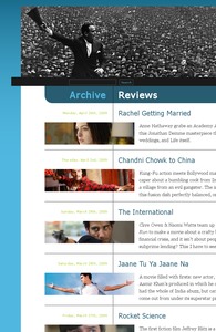
- An important part of web design is the archive pages to access older content. The archive listings here were kept fresh and very visual, with a strong cinematic thumbnail to allow visual recognition of reviews and features, without the need to always rely on the titles.
- While the site was given a strong logo identity, it was designed to be secondary on each page to the dynamic header that changes with the content of each page, really pushing forward the visual presence of the individual article.


