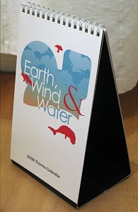
- The calendar was kept simple and clean, to allow the focus to rest on the illustrations of the creatures on each page. The vertical format also made it stand out from most table calendars.
- Each animal was painstakingly illustrated in vector using a wide range of photo references of the real thing. We wanted to make it both realistic and also beautifully rendered.
- Interesting facts about each creature were included, and the dates of the month were inserted into a simple and clean grid using the corporate colours of the company.
- The calendar was named Earth, Wind & Water to continue its environmental theme, and a very crisp and minimal cover was designed to be inviting, while not taking away from the contents too much.


