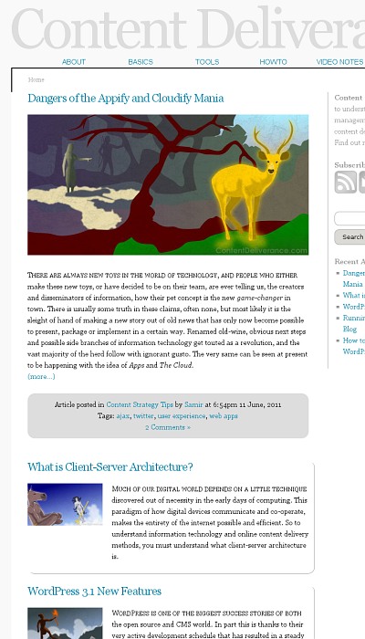
- The aim here was to stay within the confines of blog structure conventions, but also to circumvent the graphic-heavy look of many modern blogs. The information was to be given priority and the blog theme was to sink into the background.
- In keeping with the minimal and functional theme of the site, a graphical mock-up was skipped and the site layout was worked on directly in HTML and CSS, laying down the essential elements and styling them without the need of images as far as possible.
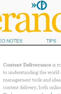
- The logo for the site was kept simple, iconic, and unobtrusive, only appearing when the mouse pointer hovered over the header. A further step to reduce the visual importance of the interface.
- Most of the minimalism was achieved and made effective with a varied use of typography. While only a basic serif font was used for most of the text on the site, enough styles and sizes were set up to produce a range of colours and densities for visual interest.


