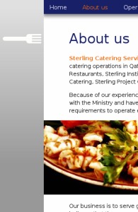
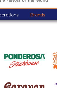
- The site layout was first and foremost meant to be clean and professional, keeping in mind the corporate audience for the site. Colours were kept to what existed in the brand palette.
- The template of the pages was kept bright and appealing while also business-like. Images were given a special treatment in the layout, making them occupy the entire width of the usable area, extending beyond the text.
- Being a relatively small site, the menu choices were few, so they were kept clearly displayed on all pages, along with indication of the current location using different text colours. Page titles were specially treated with a bold size and also a supporting graphic of the fork to maintain the culinary theme.
- As a catering company and restaurant franchisee, the site needed various individual brand pages. The interface was kept simple and visual by allowing for a grid of logo buttons for all the brands included under the Sterling umbrella.


