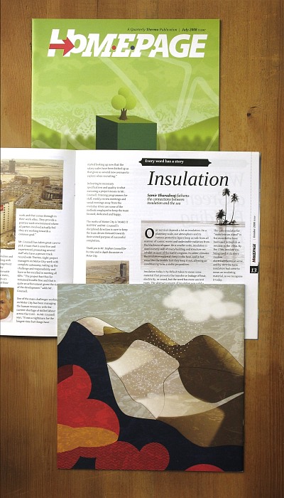
- Homepage had previously been a tabloid-size corporate newsletter, much more focused on company news and events. With this make-over it was transformed into a general interest magazine with a stylish new masthead.
- Being limited to photography of construction sites, and not having access to any obvious imagery to bring in that sense of style and sophistication, a lot of attention was put into the typography and text styles of the magazine.
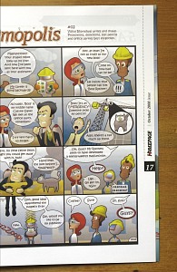
- An original comic strip with a set of repeating characters was also created from scratch to provide more light-hearted and accessible entry for casual readers.
- Long feature stories made this magazine much more of an informative and readable publication. The clean and sophisticated typography were complemented by custom illustrations for the major articles.


