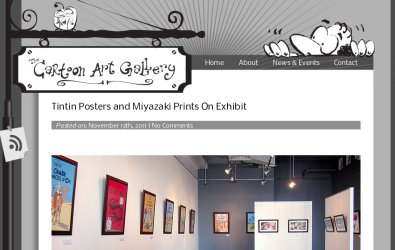
- Classic black & white animation was a big influence for the visual identity of the gallery itself, so the website was given a similar feel, utilising what graphical collateral the client had developed for the brand identity and adding additional elements as required.
- The header of the site, here seen displayed above a blog page, brought in both the sense of tradition and of cartoon whimsy into the visual template. The blog posts were given the full width of the content part of the layout to allow visuals and images to be displayed in the best quality and resolution.
- An art gallery is all about the current exhibit, so a system was designed to select a featured post and for an appropriate graphic banner to appear automatically on the front page, styled with a frame in keeping with the theme.
- The site is a dynamic one, to fulfil the needs of an art gallery. It comes with the appropriate niceties like a custom RSS icon for people to keep up with news on the site, and also connections to Twitter and Facebook to leverage social media.


