Over the past few years I have tried to get back into practice with drawing. One way I pushed myself was to sketch with a pen. The idea was to improve my courage at mark-making using the unforgiving pen, which I hope will seep into my skills with other mediums. In my recent series of fountain pen drawings, I stepped up my technique a notch to produce more well-rendered, finished drawings, so I thought I would share my thought process and shading technique for these particular pen and ink drawings.

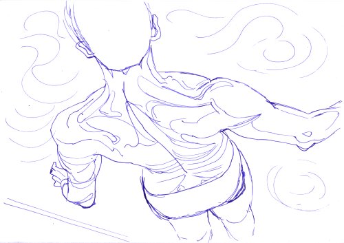
I started with the line work, which can get tricky with a pen if you’re not fluent; Gone is the luxury of being tentative with your line and relying on an eraser to correct your follies. Here, every mark is permanent, and the challenge is in achieving that perfect balance between thoughtful care and unplanned bravado. After you’ve done enough such sketches, you get a feel for which lines to make and which to ignore. The idea is to have stronger solid line-work to demarcate the boundaries of the forms (the outline), while using more light gestural lines for the internal topography of the shapes. Only draw the bare minimum required to make shading the lights and darks clear. Too many contours will interfere with the hatching later; Too little will leave you rudderless when trying to indicate the third dimension.

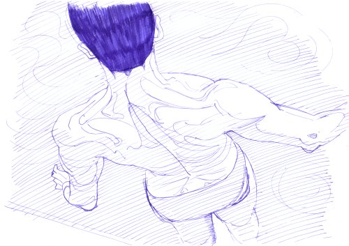
Now comes the part where crucial decisions are made. I mentioned topography before, and that will seem more appropriate now because this middle stage of these sketches reminds me a lot of contour-line topographic maps. The hatching lines here serve a similar purpose. Once you have the finished line sketch, you decide on what parts of the image are going to be at a medium grey and darker. Those parts are covered with an even hatching pattern. Here I chose to do simple diagonal lines, because I like their dynamism. Then you go in and fill in the darkest parts of the images, the parts that are meant to be near-black and not have too much nuanced value. At the end of this stage you end up with a map of your drawing indicating the light-value portions (blank), the dark value portions (hatched), and the very-dark portions (filled-in). This organisation and structure already begins to show you the form of the subject and the way light falls on it. An essential resource as you further render the piece.

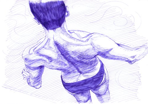
In the final stage, you apply some very light hatching in the light but non-white areas of the image, and then you draw progressively closer and heavier hatching in the darker areas of the image. This gradation of hatching densities and intensities creates the smooth range of value you’re looking for, in spite of it all consisting of distinguishable pen marks.

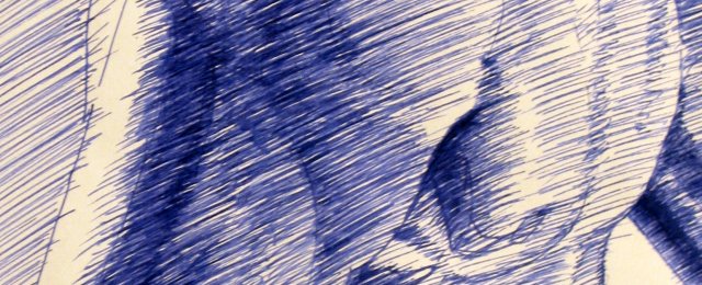
 This last stage of shading deserves some further exploration. Since pen strokes can never be smoothened into an even tone like pencils, you try to keep the direction of strokes consistent to bring some organisation to the proceedings. While my technique is not as formally rigid as some traditional pen and ink techniques, it does use the consistent diagonal stroke to prevent the image from descending into a noisy chaos. Traditionally, pen and ink drawings were often rendered like clean engravings because of the limits of print production at the time. Image plates for books would be produced as metal etchings and hence the clean and ordered lines were essential for clean printing. Today that limitation is less relevant, although it still makes for an impressive visual effect.
As you can see from the detail of a torso sketch above, the strokes are even but not parallel and pristine. I like the mix of order and chaos this produces, though I must admit it comes from a lifetime of shading with a pencil. A more organised hatching style will take me a lot more time, practice and discipline.
The stages of completion of the torso sketch show my way of working through the image, one section at a time. I prefer producing a full range of value in each part of the image before moving on, although some back and forth is always required to adjust relative values and smoothen drastic jumps in shade between sections. Once all areas have been covered, it’s always a good idea to evaluate the image and make some adjustments. You can’t lighten areas drawn with a pen, but you can darken areas to increase contrast between the lights and darks when more clarity is needed.
And that, in not too small a nutshell, is my current set of shading techniques for pen and ink drawings.
