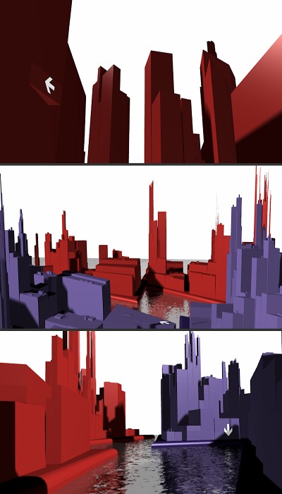
- Having no existing video footage to work with, we created stylised 3D animation, including this one of a city scape to create a sense of drama in what was an information heavy presentation.
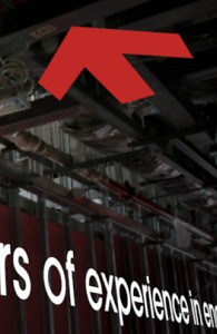
- Brand specific visual devices, such as the arrow, were used to transition between the sections of the video about the different departments and specialities of the company.
- Each of the company’s activities was represented by icons to visually categorise the sections of the video and the images being displayed.
- Scrolling text and photographs from actual projects were mixed with animated symbols and graphics to communicate in a clear and aesthetic way.


